alstroemeira
A passion project which blossomed from a love of complimentary colours.
Using gels, the aim was to accentuate the petals intricacies, and result in a vibrant fusion of organic beauty, where leftover blooms became a canvas.
Art Direction : Anna Featherstone
Photographer : Oliver James Campbell
The creative direction was based on the above images, found on Pinterest. The plan for the collection of imagery was to use the 3 flowers which were available, and photograph them with the complimentary colour as the backdrop.
Originally these images were going to stand alone as a set of feature photographs, however through type experimentation I wanted to use them as a foundation for a Kombucha brand.
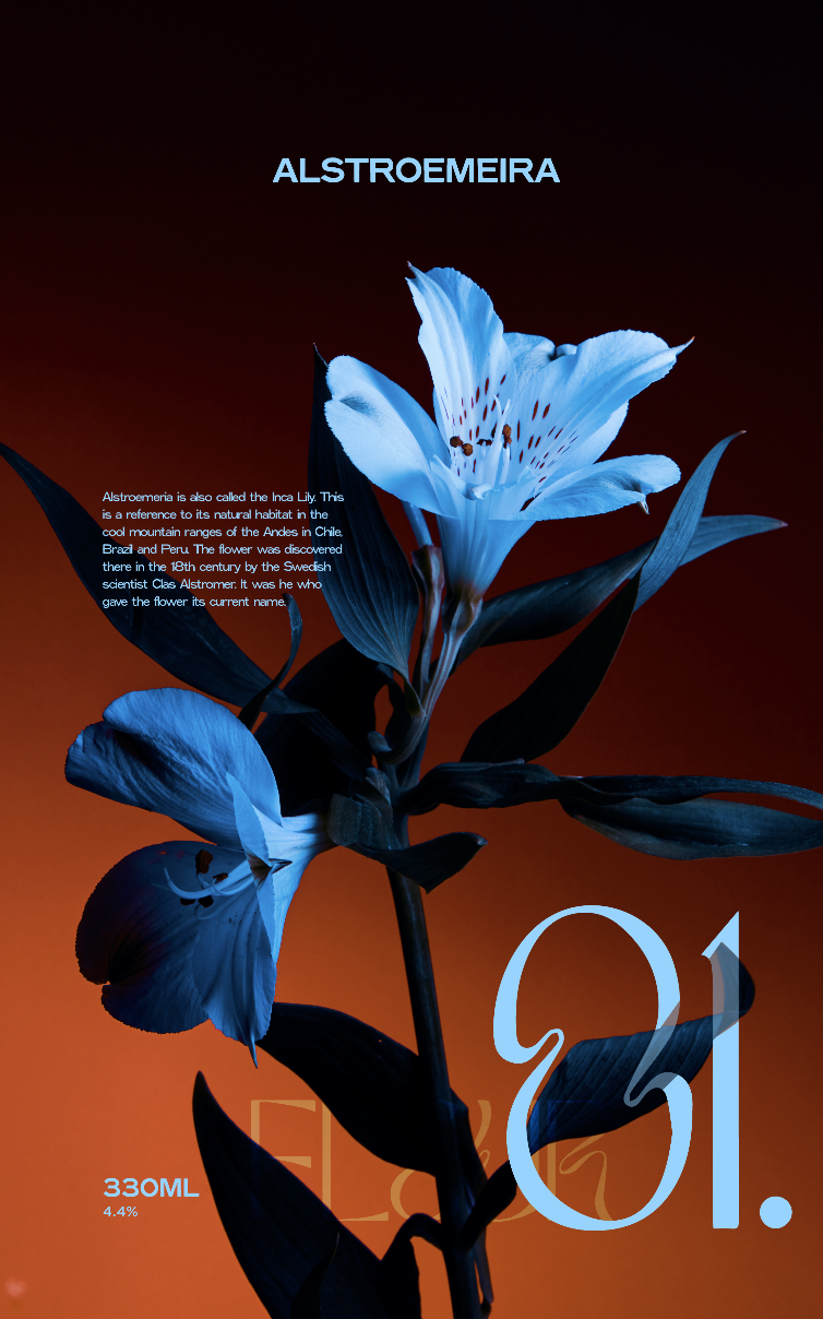
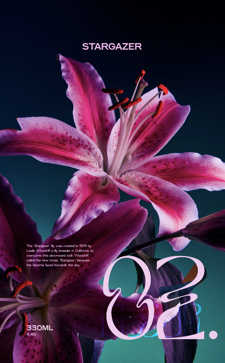
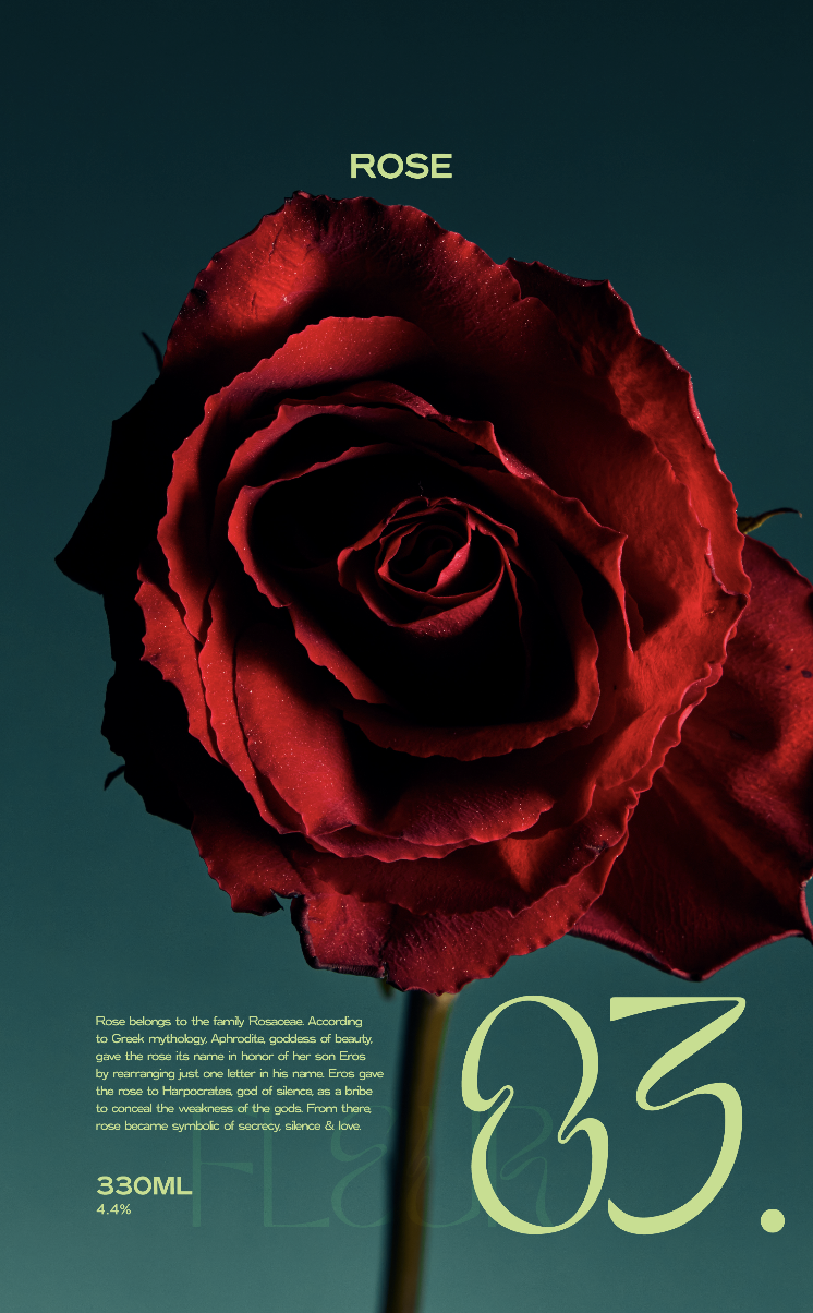
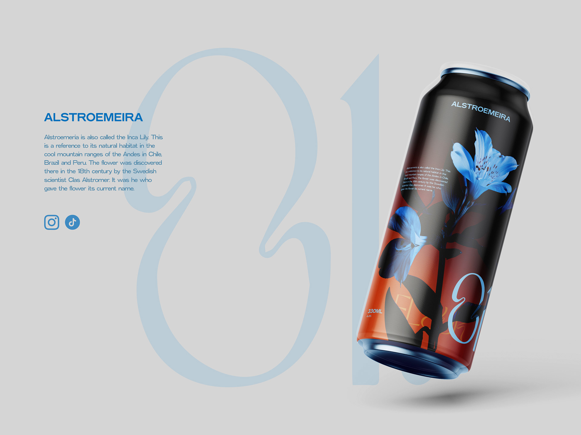
Drinks, a new terrain for myself, but a challenge I wanted to set to develop my design skills in packaging. I began by designing 3 posters, inspired by the heritage of each flower.
Alstroemeira, another name for the Inca Lily, is a reference to its natural habit in the cool mountain range of the Andes in Chile, Brazil and Peru. The flower was discovered there by the Swedish scientist Claus Alstromer. It was he who gave the flower its name.
The kombucha brand I wanted to design for was one which used natural products, like flower essences to help balance your aura, physical and spiritual wellbeing. And with this in mind, I wanted to use the name Alstroemeira for the brand.
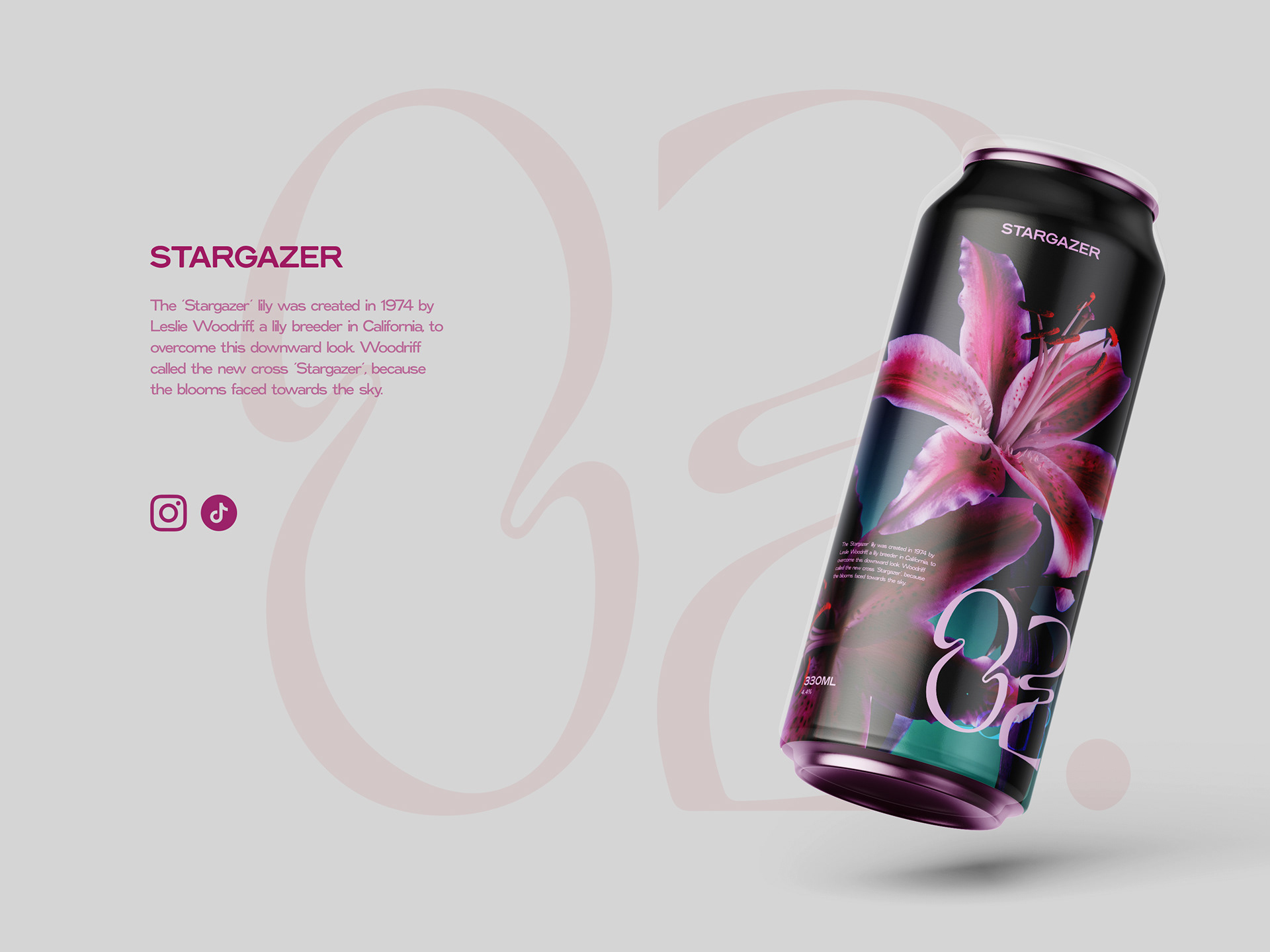
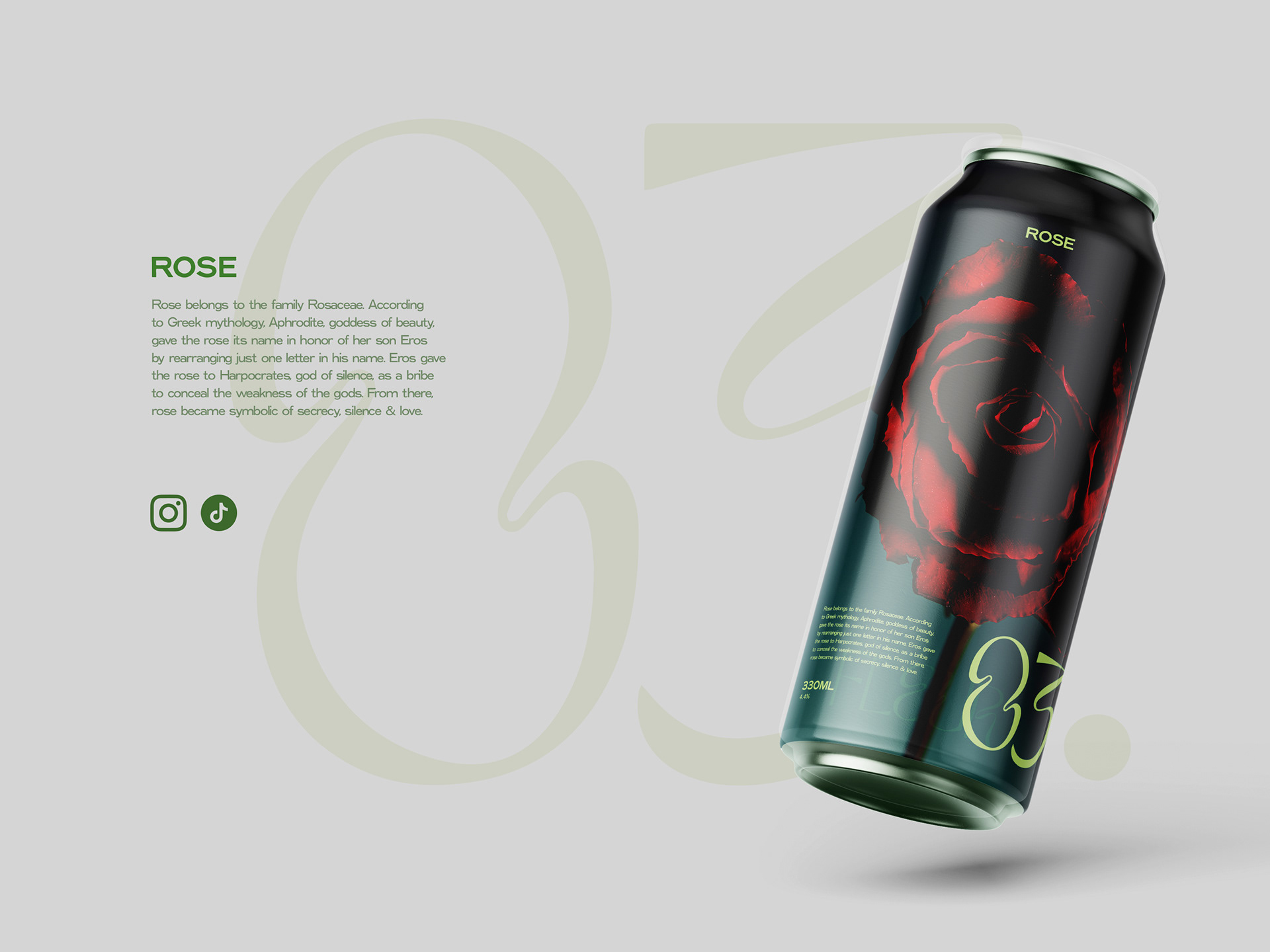
The kombucha brand prioritises organic elements, promoting balance. All ingredients lead back to the origin of where the flower was first found. Through research and thoughtful design, the project not only expanded my skill set but also wove a narrative that transcends aesthetics.
A brand offering holistic well-being through the essence of florals, encapsulating both their cultural heritage and intrinsic healing properties. Whilst also having a calming image to look at, when consuming the drink.
If I were to redo the project, I would have purchased more flowers to create a larger collection. I would have also found another way to include the paragraph about the heritage of the floral essence in each unique drink, as it works well for a poster but not as well on the front of the can. Instead of placing it on the can, I think I would have created a card, which you receive with the drink, which has a map and the explanation.