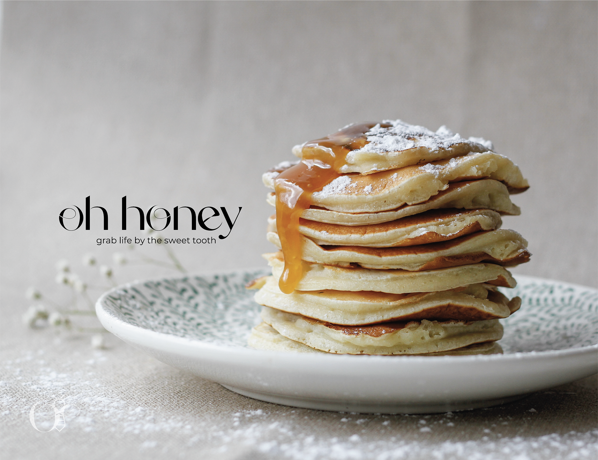
OH HONEY BRANDING
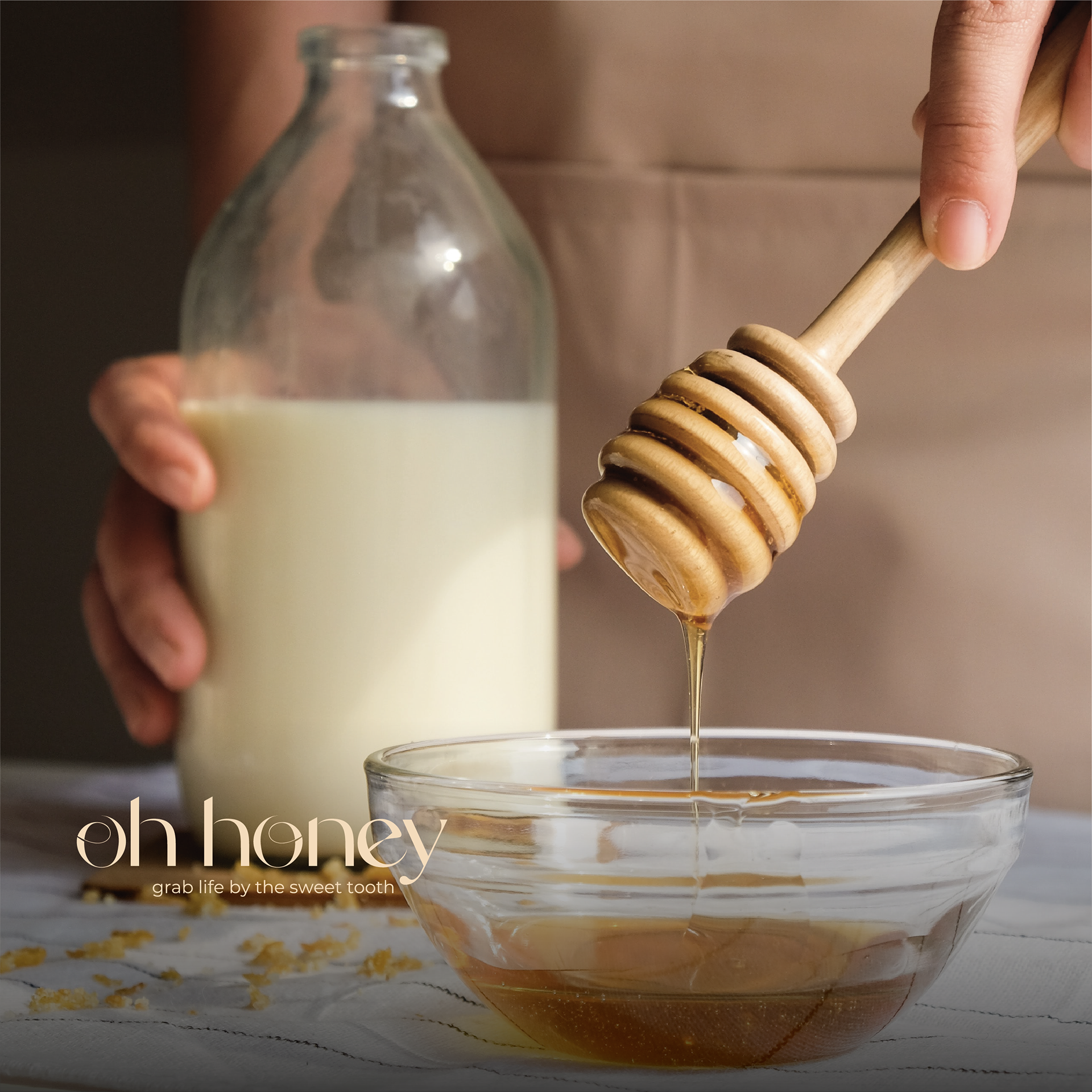
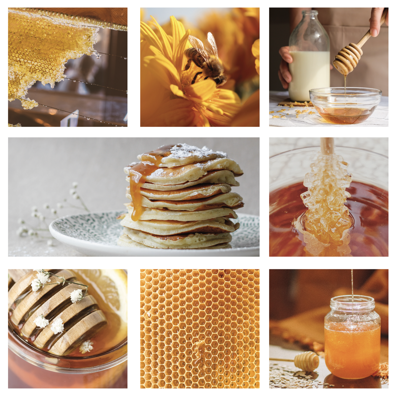
Oh Honey is an organically and locally sourced honey brand, that specialises in crafting pure and natural honey. They are based in the UK & have their own bee keeping farm where the honey is sourced.
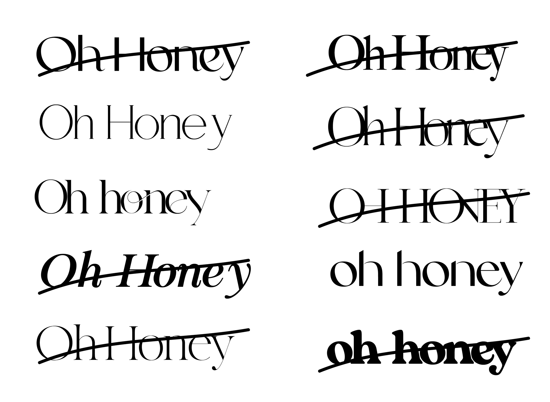
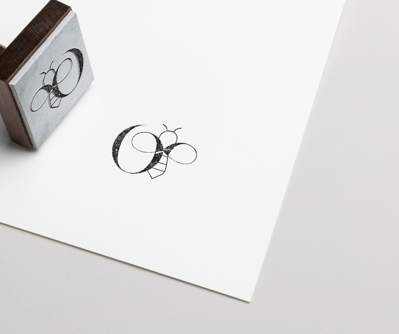
Above is the process I went through in creating the main logo, and sub mark lockup.
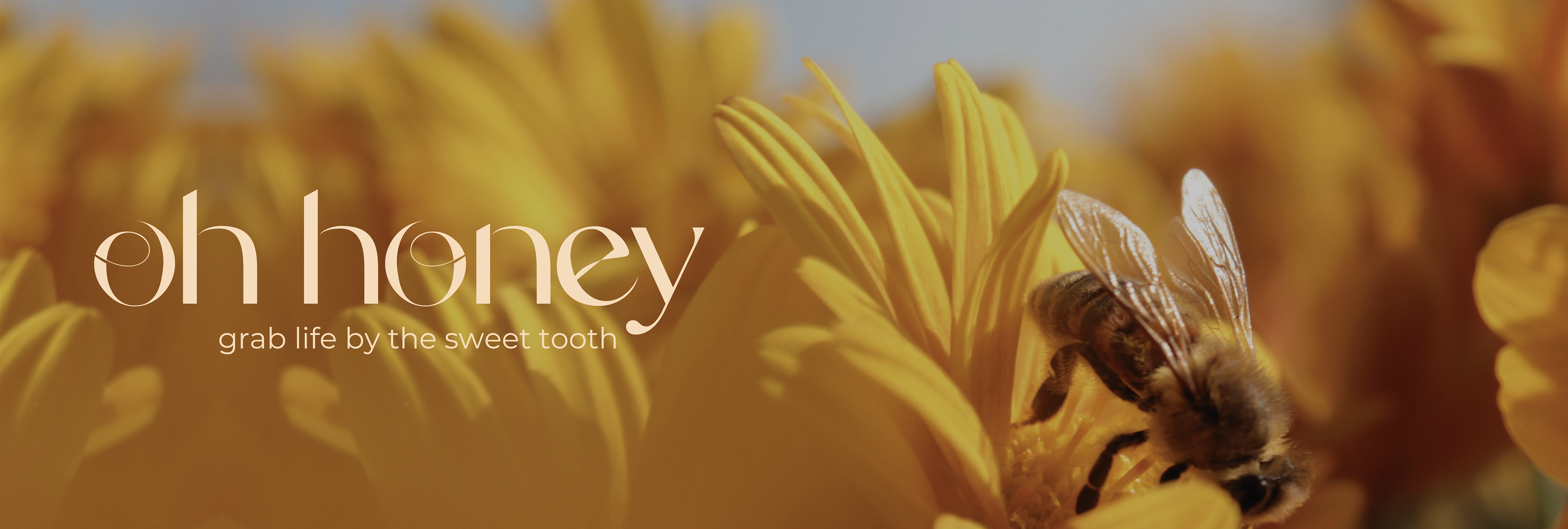
The aim for the logo was sleek and polished. Oh honey's message is simple and the proof is in the pudding; locally sourced honey from farms which you can visit. This brand is all about transparency, and the logo needed to emulate this.
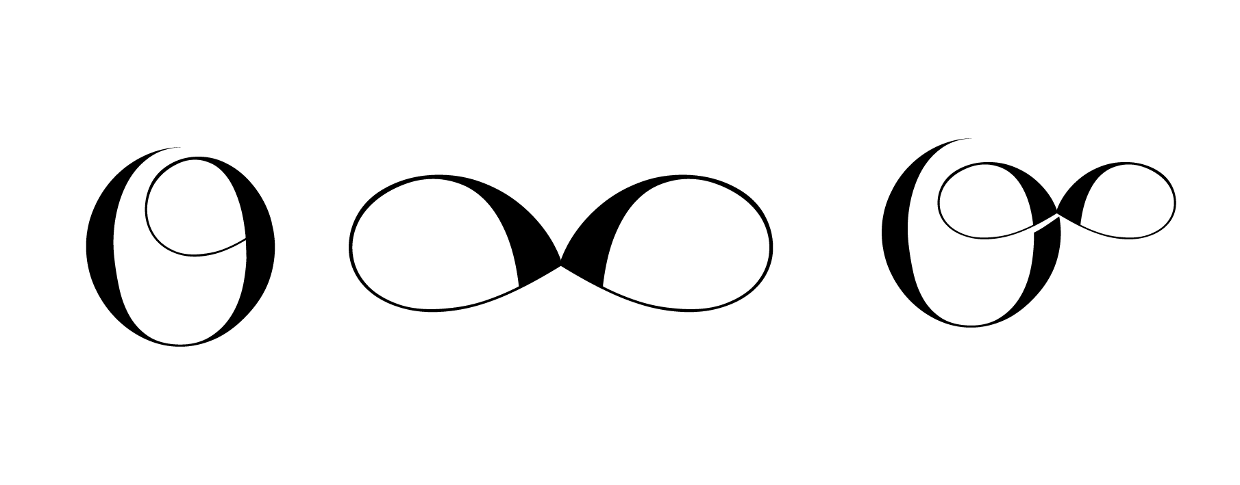
I wanted to somehow incorporate a bee's wings. I originally tried with replacing the o's but that did not work. Then I liked how the O's from another font had a curve in, so I emulated this and made them sharper to look like wings. From this I was able to make the submark logo, which will feature heavily on the brands packaging.
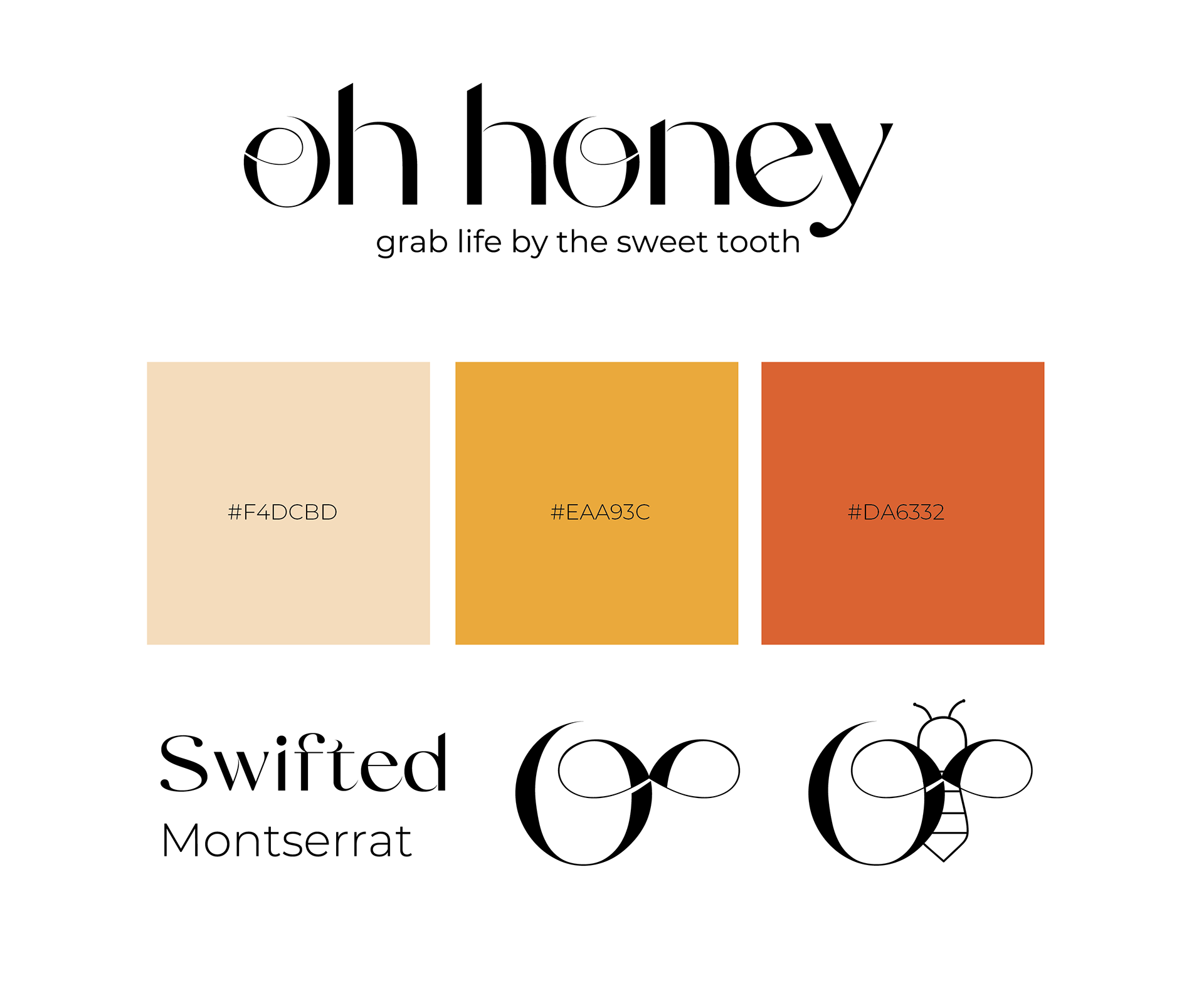
The brand is currently experimenting with flavoured honey, but for the minute have perfect 1 flavour called hot & smokin' alongside the original, called pure & natural.
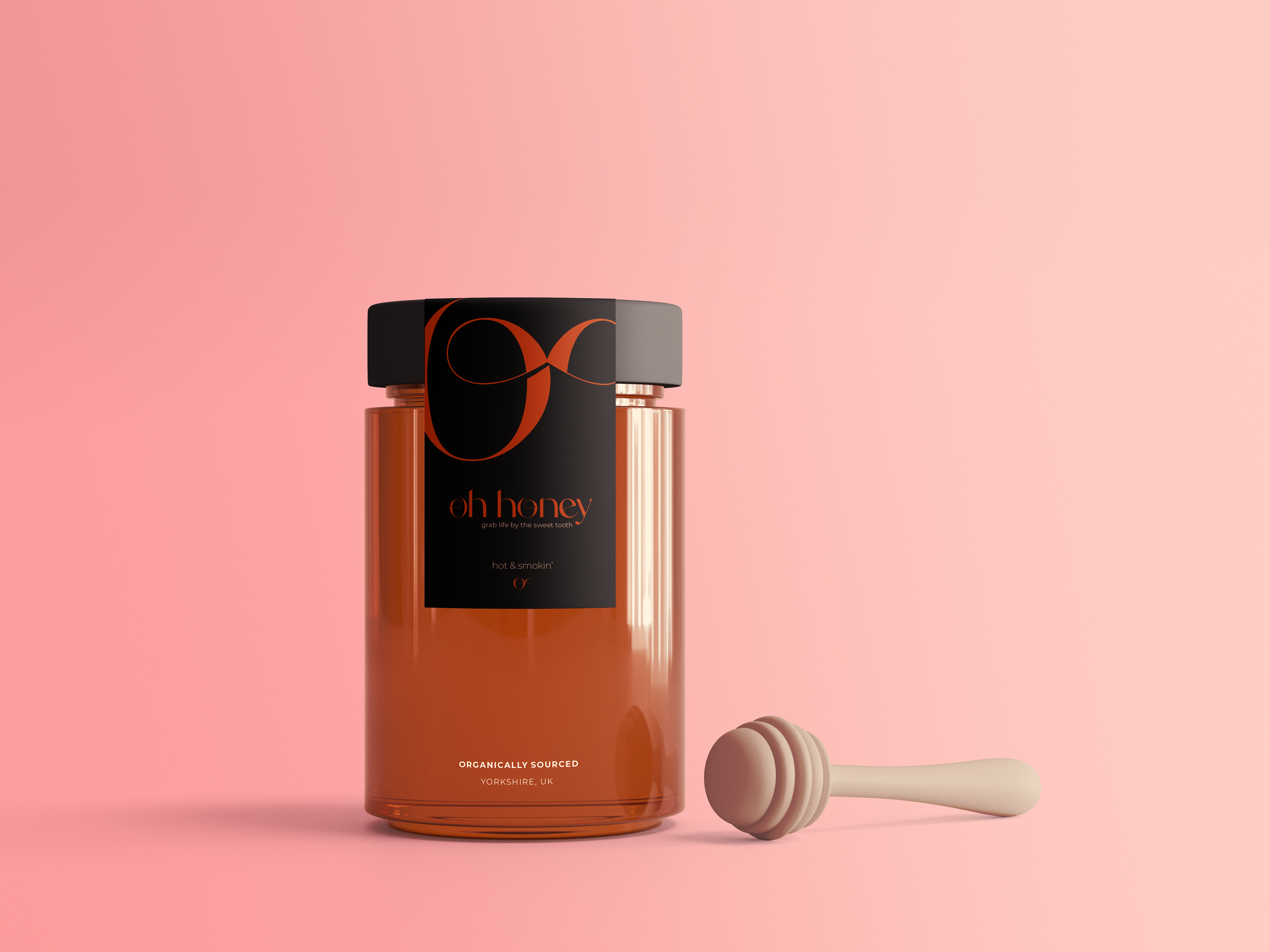
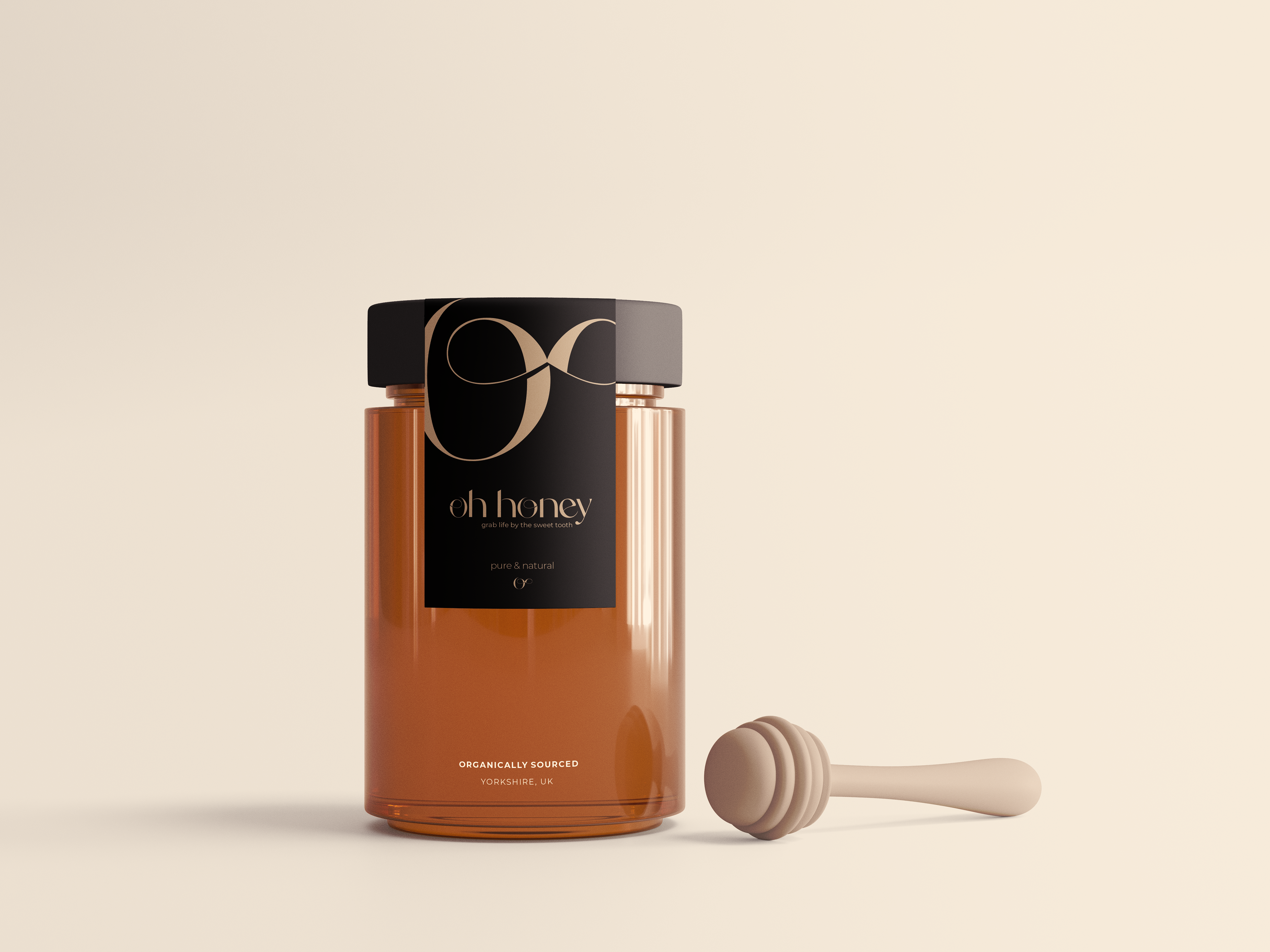
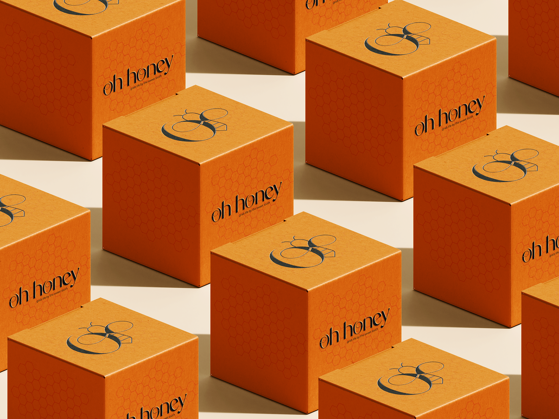
Oh honey's packaging is 100% recyclable, with PET plastic lids, glass jar and paper labelling. The boxes which are used if orders are being shipped, are recycled cardboard.